

Example 1:
book cover
Goals:
Create a book cover that stands out
Make a book cover that is visually compelling
Reimagine and modernize the book cover aesthetic.
My Results:
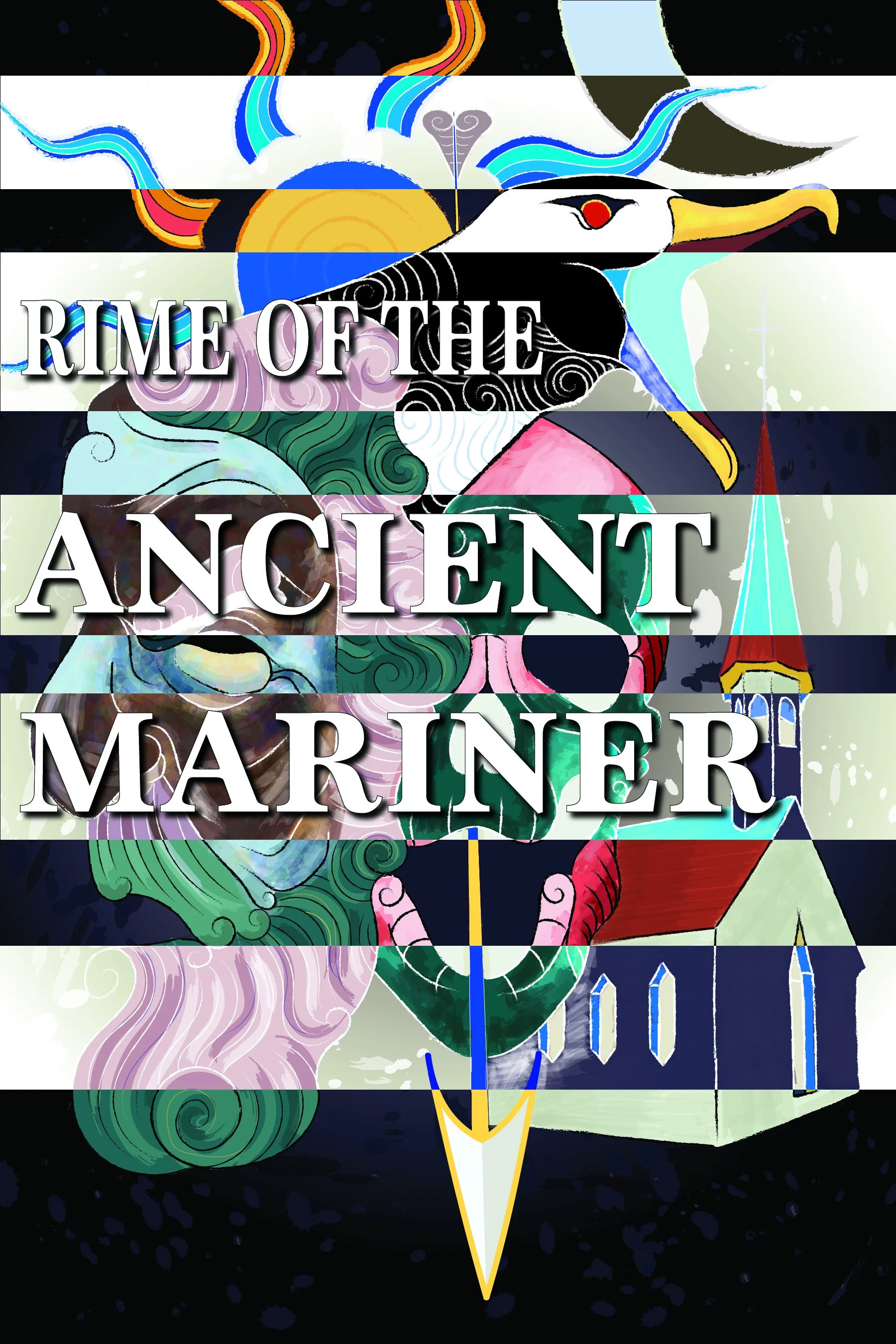
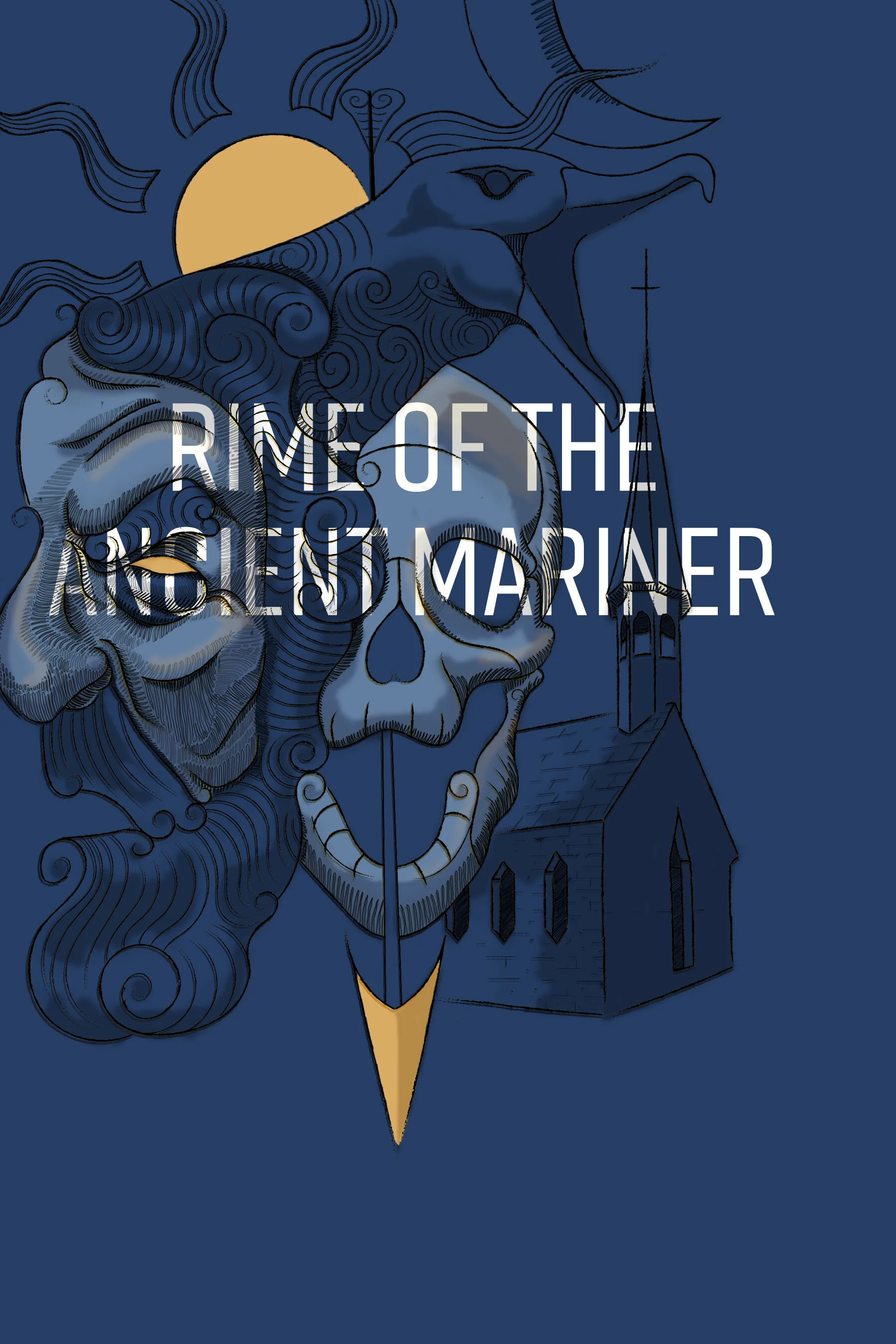
Front Cover
Cover Page
Back Cover
Research:
The existing book covers for The Rime of the Ancient Mariner:
hit on a number of existing symbolism, mainly:
a skull
the albatross
the boat
the mariner himself.
The book cover art had very little coverage of the page and worked as more of an ascent.
The book covers, in my opinion, often did not employ the fantastical aspect of the poem.
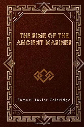
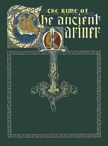
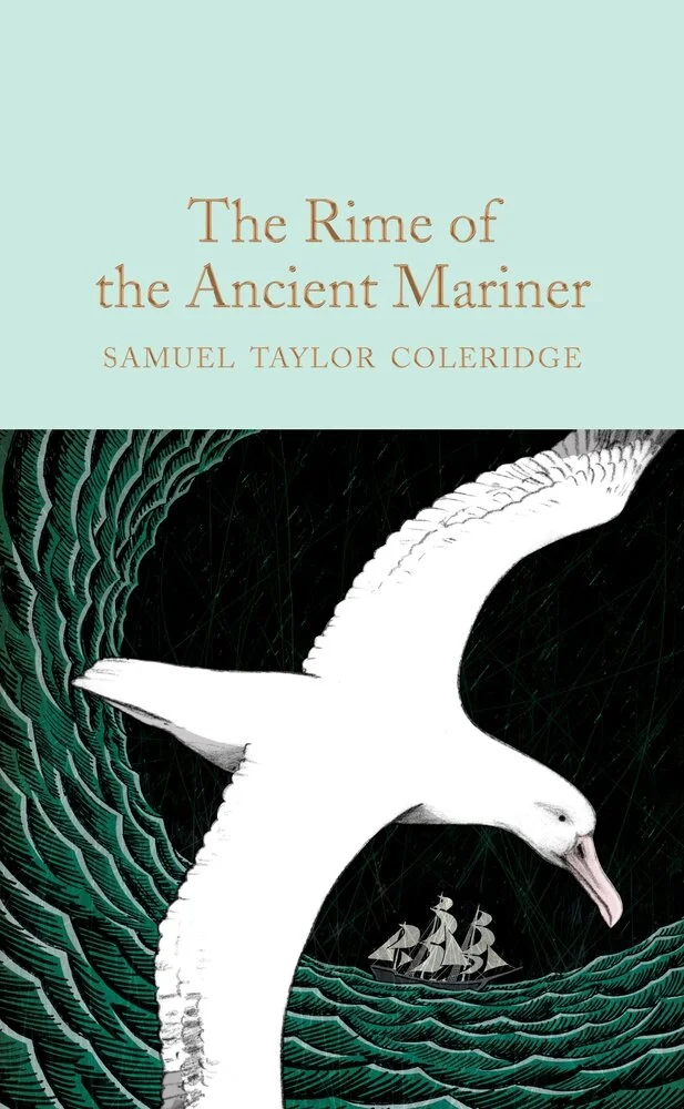
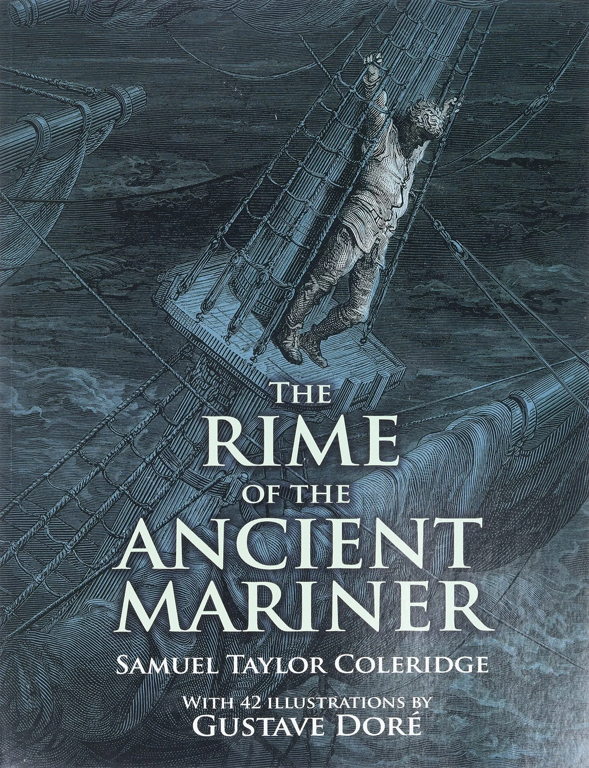
All book covers in the slideshow above are not done by me, but are used as examples of some of the covers I looked at for my research.
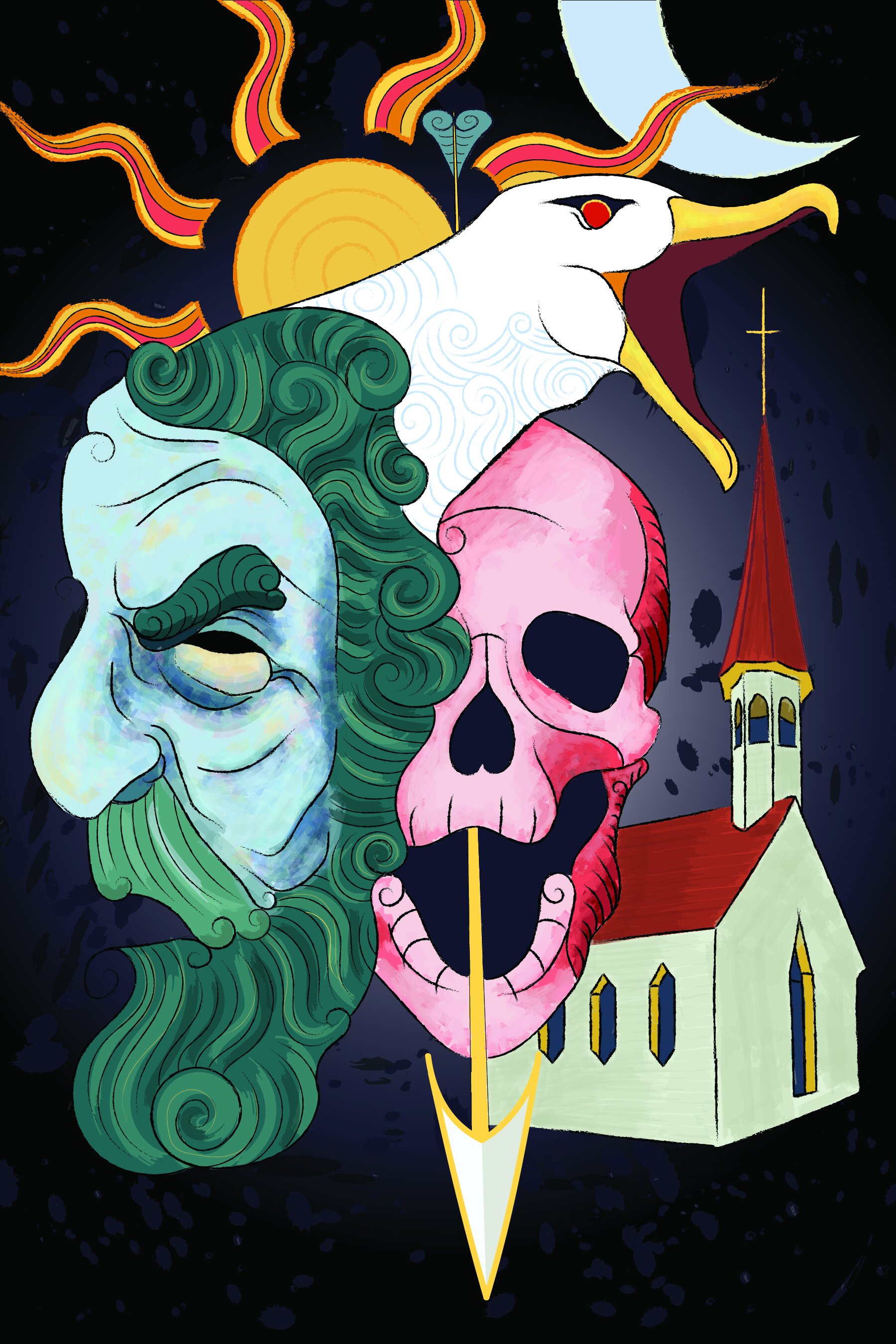
MY WORK!

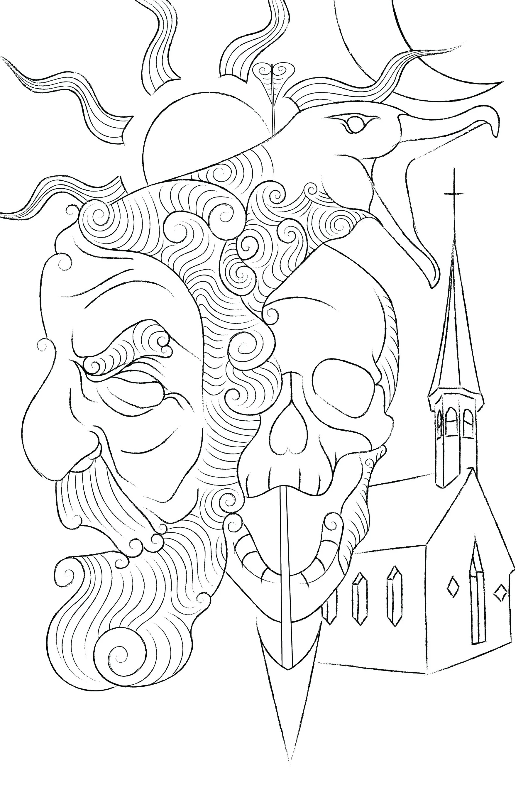
The Drawing
I knew in the beginning I wanted a fairly packed composition with many elements from the book on the cover.
The albatross and the mariner are connected in the head to symbolize their connection in the story.
The church in the background as it is the setting in the background of the story.
I used a greek statue as the model for the mariner to try and pull from the idea that the poem is intended to seem older than it really is.
Overall I think this step went really well and looking back remained the backbone of the project.
Coloring - First Take
There is not a lot working for me here. That being said, I learned some important things that lead me to the final image:
The albatross doesn’t not look good connected to the mariner when the drawing is colored.
I tried many different color combinations but could never get the two to mesh together without the overall composition suffering. When the mariner and the albatross were the same color they dominated the overall color composition of the page, becoming a “looming figure.”
The colors are not working well together .
The rendering either needed to get more or less detailed from here.
The line drawing itself might need more detail.
Coloring 2 -
Doubling Down and Taking a Step Back
Trying to make the piece more visually interesting, I inverted the colors. It looked like a drawing of an x-ray. Which was not what I was going for but had something in the overall tone that I liked.
One of my goals for this piece was to modernize it and Inverting the color in sections gave me very early 2000’s medical drama vibes. I really liked that aspect of it and tried to make it work with what I already had.
Stacked blocks of inverted and inverted color sections with text over it. It ended up more visually interesting but very hard to read, and very cluttered.
I decided to go back to the sketch. I was looking for more visual information and relying too much on effects to get me there.

The Drawing 2 - Back To the Board
Tried to add more depth and visual information into the piece initially by solely highlighting the mariner with cross-hatching.
Coloring 3 - Trying a New Angle
The previous attempt to color the piece resulted in a crowded image with too many colors. For this take on the color I wanted to limit the color and add a lot more open space in the composition.
I ended up with something off-center and not necessarily moving in a terrible direction, but I wanted even more detail so went back to sketch one last time.
Drawing 3 - Final Drawing
Much better
Coloring 4: Final Coloring
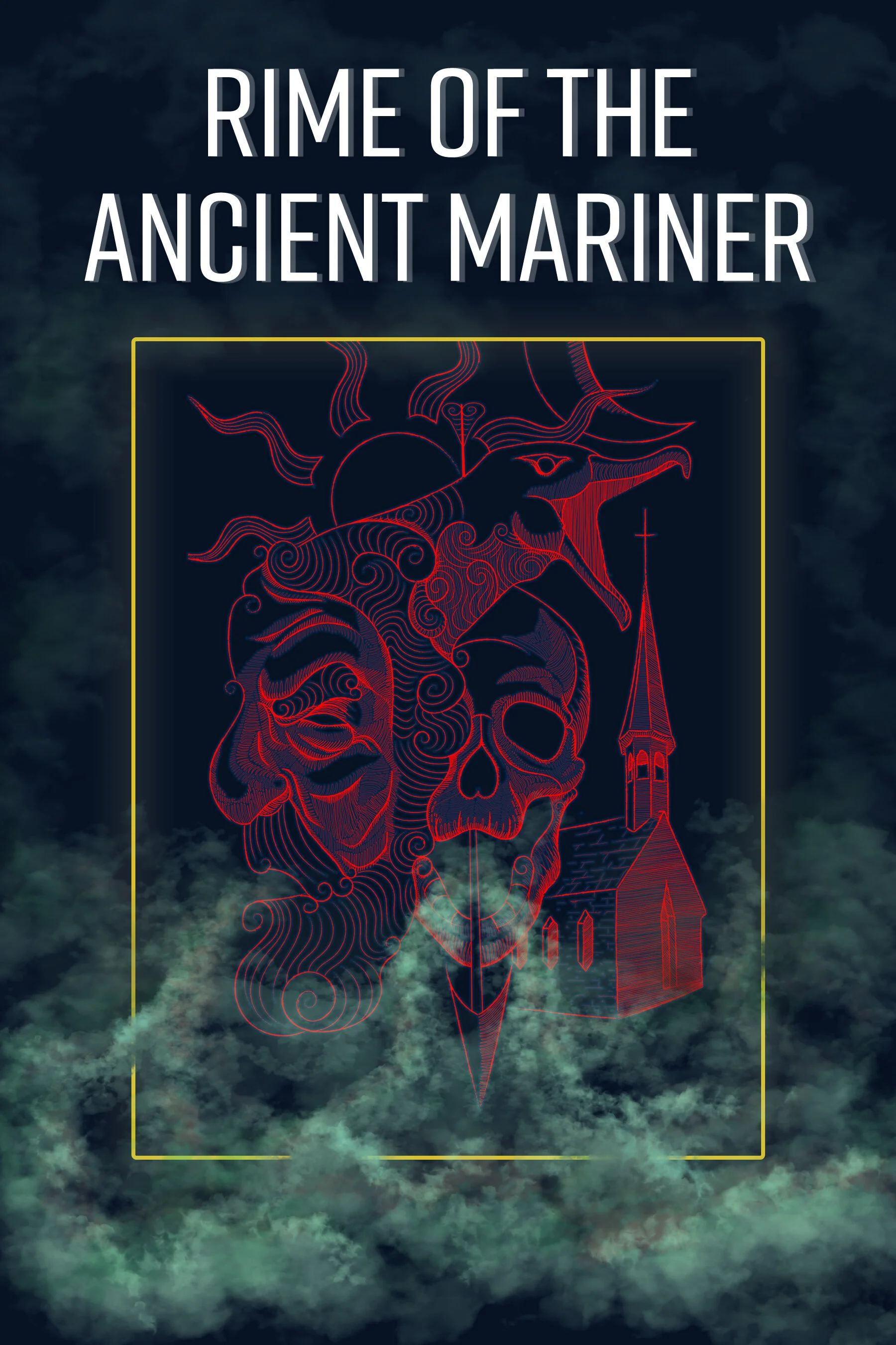
Going from the final sketch to the final coloring I wanted to apply what I learned from the previous iterations of the piece. I continued to make the sketch smaller, and put it in a rectangular thin border, which is more akin to the older iterations of the cover. I wanted to lean into some more fantasy aesthetics clichés so I added some colored fog coming out of the mouth of the skull and added glowing on the sketch and border.
From here I create the back page and cover page from assets in the front page.