


Personal Project:
Chinese American Takeout Menu
Background
This project began as both a design exercise and a personal tribute to one of my favorite comfort foods. Growing up with severe dairy allergies, Chinese American takeout was one of the few cuisines I could reliably enjoy, making it a familiar and comforting part of my life.
Project Goals
Improve menu legibility
Modernize the visual design
Reorganize content to create a more intuitive browsing experience
Research & Discovery
During my research, I found that many Chinese American takeout menus share a remarkably similar visual language. Most were presented as flat, bi-fold, or tri-fold menus containing well over 100 items, often with little supporting imagery or description due to space constraints. Common design elements included dense layouts, red-and-black color palettes, and pricing structures based primarily on protein selection rather than preparation style.
While these menus were highly functional, many suffered from visual clutter and difficult navigation, making it challenging for customers to quickly locate items or compare options.
Design Approach
My redesign focused on improving readability while preserving the familiar feel customers expect from a traditional takeout menu.
I reorganized menu categories using principles of menu engineering, placing featured and higher-value items within areas that naturally receive the most visual attention. I also reduced visual noise by consolidating pricing structures, removing unnecessary cents and currency symbols, and eliminating leader lines that encouraged price comparison over food selection.
To address choice overload, I streamlined many categories and created a clearer visual hierarchy, allowing customers to scan the menu more efficiently while still maintaining the broad selection associated with Chinese American takeout.
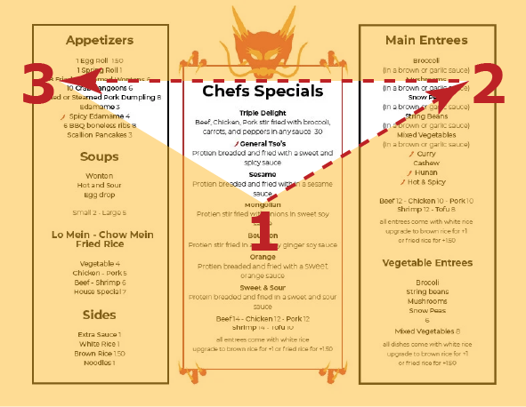
Design Principle: the “Golden Triangle” of menu design
Result
The final design maintains the variety and familiarity of a classic Chinese American takeout menu while improving organization, readability, and overall visual appeal. The project demonstrates the application of research-driven design decisions, menu psychology, information hierarchy, and branding within a real-world print format.
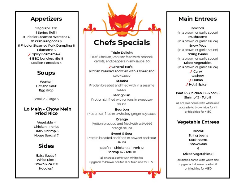
Front
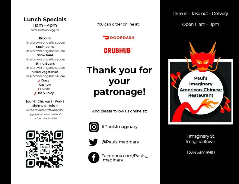
Back